Creating professional-looking labels requires attention to detail and adherence to certain design principles.
Firstly, choose high-quality materials for the intended use and environment, ensuring durability and longevity. Select fonts that are easy to read and complement the overall design aesthetic, avoiding overly decorative or distracting styles. Maintain consistency in font sizes, colors, and formatting throughout the label to enhance readability and visual coherence.
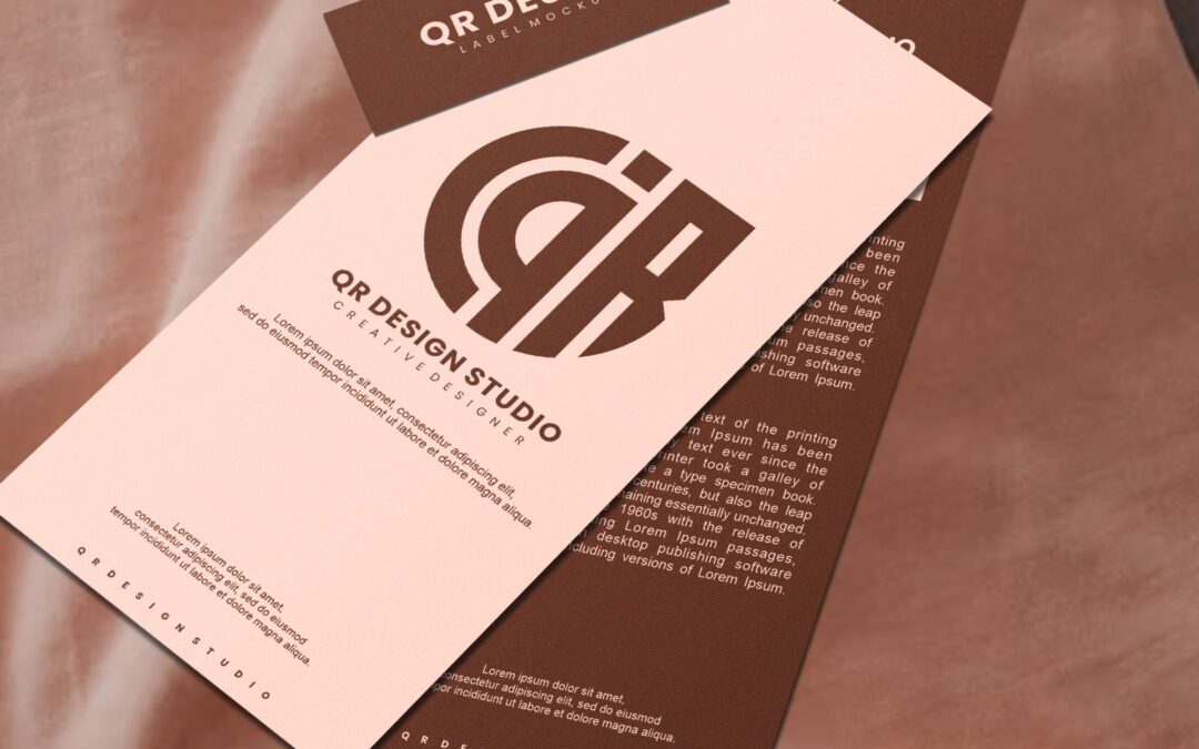
Opt for high-resolution artwork that remains crisp and clear when printed for graphics and images. Use professional design software or templates to ensure precise alignment and proportions and avoid overcrowding the label with excessive text or imagery. Prioritize essential information such as product names, ingredients, usage instructions, and any relevant warnings or disclaimers, ensuring it is prominently displayed and easy to find.
Consider incorporating branding elements such as logos, colors, and taglines to reinforce brand identity and create a cohesive look across different products or packaging. Pay attention to spacing and layout to achieve a balanced and visually appealing composition, and utilize white space strategically to enhance readability and draw attention to critical elements.
Finally, always print a test sample of the label to check for any errors or discrepancies before producing a larger batch. Take the time to proofread carefully for spelling and grammar mistakes, and ensure that all information is accurate and up to date. By following these tips and investing in quality design and printing, you can create professional-looking labels that effectively communicate your brand message and enhance the appeal of your products.