Selecting the right color for your e-commerce label design
The visual elements are the main determining factor when consumers select one product over another during an online shopping visit.
COLOR is KEY. Color is the first element that catches the online customer’s eye. Too many colors and your product will appear “muddy” on screen. For North American online shoppers, the following colors evoke certain emotions:
YELLOW
Optimistic and youthful: This color is often used to grab the attention of window shoppers. Yellow evokes clarity and warmth. For example, IKEA and Mcdonald’s purposefully use yellow to make the buyer feel happy when seeing and thinking of their brand.
ORANGE
Aggressive: Orange is great for calls to action like subscribe, buy, or sell. At the same time, this color makes a buyer feel confident.
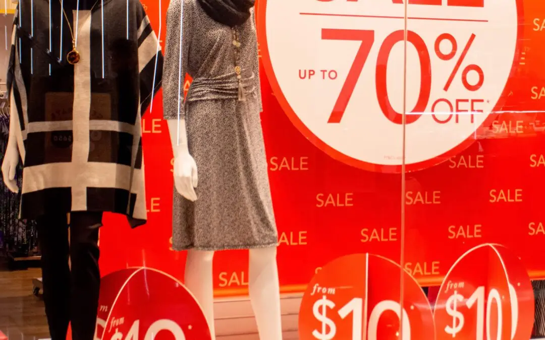
RED
Excitement: Red is a primal color associated with urgency, which is why it’s most often used with clearance sales. This color is helpful for spontaneous purchases and is bold when used with brands like Coca-Cola and Target.
PINK
Romantic and feminine: This is the color most frequently used to market to women and girls for its feminine appeal. This color is used to create a feeling of softness and serenity.
PURPLE
Creative and wise: Purple is used as a soothing color in shopping. This color is often the mark of creativity and imagination, which is especially effective for making the buyer feel that a product is luxurious or artistic.
BLUE
Dependable and strong: Blue is a serene color used to evoke feelings of trust and security in buyers. For this reason, blue is the go-to color for many banks and businesses.
GREEN
Peaceful and healthy: Green is best to use when conveying relaxation and is associated with money, nature, and health. Green is most effortless for our eyes to process and is used to calm a buyer.
GRAY
Balance and innovation: Gray is the color we see when we think of technology – for a good reason. This color is anything but bland and can be used effectively to symbolize neutrality, innovation, and knowledge.
BLACK
Power and sobriety: Black can be an excellent color for E-commerce professionals looking to market towards luxury. This powerful color can be used for a wide range of emotional responses.
There you have it! Clean, simple label design with a few key points, great color to attract your target demographic, a UPC to keep the scanners happy, and “voila!” – you’ve positioned yourself for success with a great label design for e-commerce.